The concept document for SelFish had no planned or explained GUI, so my team and I had to come up with an idea of our own. We discussed our target audience and what they thought would be appealing and decided to have a game based on high-score, though we thought that basing it only on high-score alone would be a bit dull. To solve this, we came up with a high-score system that affects the power-up, which we decided to call “frenzy mode”. We decided to display the high-score and the frenzy mode separately, to make it as clear as possible. We also decided that the main character, Stephen, should have at least 3 lives, and we wanted to display that clearly to the player as well.
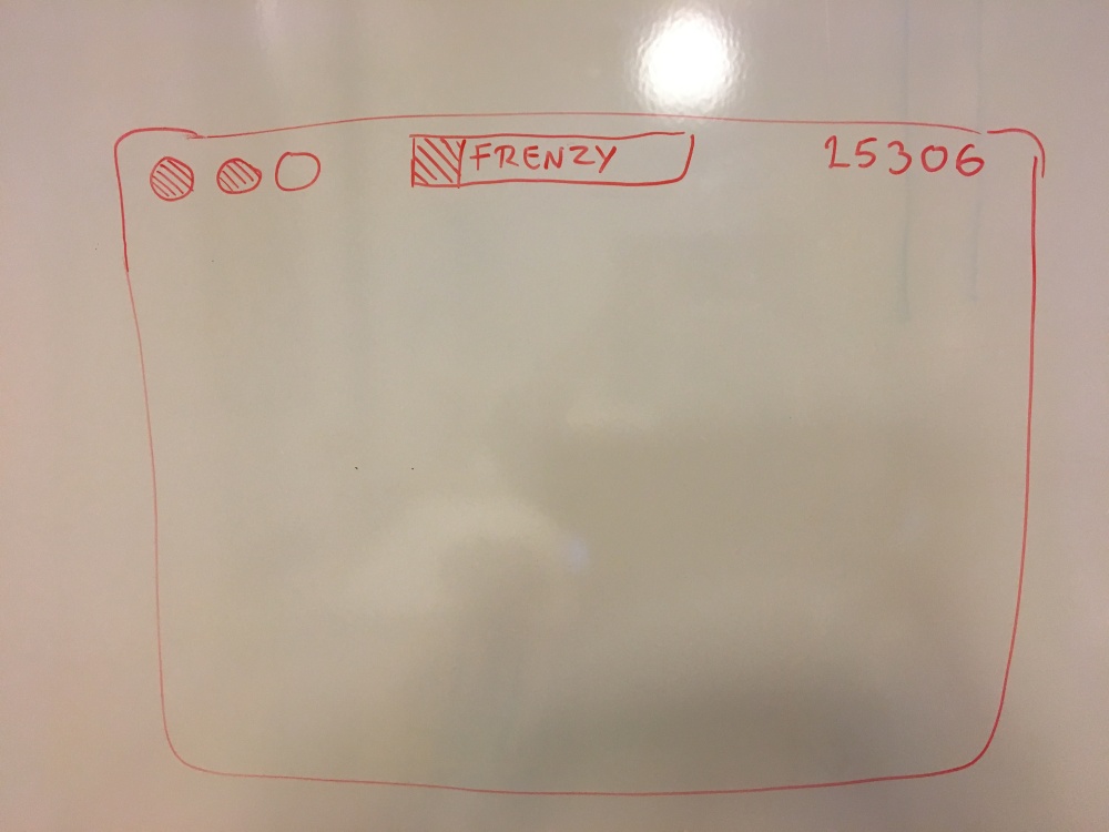
Stephen’s life is going to be represented by images of his face in the upper left corner of the screen, and if the player loses one life one of the three images will disappear.
The frenzy mode bar fills up when the player gains points and the combo count is activated. The player can choose to activate the frenzy mode at any given time, but it will last shorter if they decide to activate it when it’s only partially filled. We decided to place this in the middle top part of the screen so that it is one of the easiest things for the player to locate. We thought that this was necessary since the player will need to look at it and assess how much of the power-up there is and if they wish to use it.
We placed the high-score to the upper right corner of the screen to separate it clearly from the frenzy mode. We wanted to display the high-score on the screen since the game is based on beating it, and the player might want to know how they’re doing in the middle of a level.
When we designed this we made use of a whiteboard and played around with how we wanted it to function, and what the player would respond positively to. We decided that the player should be able to use the frenzy mode at any given time to give them as much control as possible. We also wanted to make them think and evaluate when it’s necessary to use it since it does benefit them to charge it up.

You do a very good job of explaining what you have been working on, explained your thought on why the task was important, both from an audience perspective but also as a general design decision where it should be placed. It’s clear that you and the group sat down together and figured it out. The way you broke down each UI element made it possible for me to visuialize the UI, even without the picture!
I have two critisisms, one is: “We wanted to display the high-score on the screen since the game is based on beating it[…]” doesn’t really explain to me how the game is actually beaten. My best guess would be that continous waves of enemies spawn and you survive as long as possible, but it’s a bit confusing as it also could mean that you are supposed to beat waves of enemies and continue to other levels.
Secondly, the last paragraph is kind of reduntant since you’ve already explained why it would be useful for the player to use the powerup whenever he/she wants. The only new information offered is that you and your group worked together on a whiteboard to discuss this mechanic.
LikeLike